The True Size of Africa Explained
Africa Is 11.68 Million Square Miles — Why Maps Make It Look Smaller
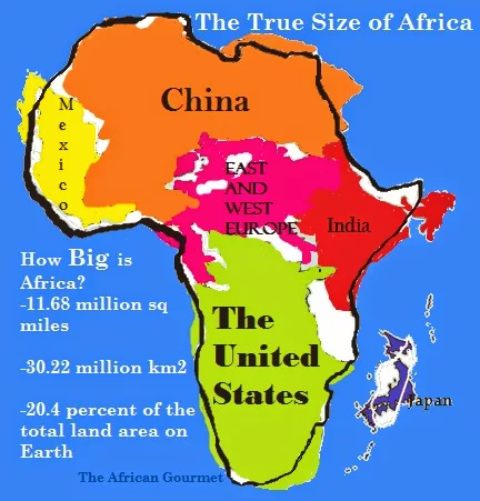
Africa covers about 11.68 million square miles (30.22 million km²), roughly 20% of Earth’s total land area. Yet on most school maps Africa looks much smaller than North America or Europe. Why?
Countries like Mexico, China, the United States, India, Japan, and most of Europe can all fit inside Africa’s borders. The mismatch comes from how common map projections distort area.
The Mercator Projection and Its Limits
The Mercator projection, created in 1569 by Flemish cartographer Gerardus Mercator, was designed to help sailors navigate straight lines across oceans. It preserves angles and directions — great for navigation — but not area.
As you move toward the poles, the Mercator projection stretches landmasses. Greenland and Europe look huge, while Africa, closer to the equator, is visually shrunk.
Did you know? Greenland appears nearly the same size as Africa on a Mercator map, yet Africa is actually 14 times larger.
Alternative projections — such as the Peters, Robinson, or Winkel Tripel — try to balance shape and area. The Peters projection, for example, shows countries’ true size relative to each other, helping correct our mental image of global geography.
The “Greenland Problem” and Immappancy
Cartographers call the false impression created by Mercator the Greenland Problem. Many people believe North America or Europe rival Africa in size because of this distortion. In reality, Africa is more than three times larger than the United States.
In 2010, German graphics engineer Kai Krause created a viral map to fight immappancy — the widespread lack of geographic knowledge. He showed how multiple major countries fit easily inside Africa to highlight how map design shapes our worldview.
The lesson: maps are not neutral. Every flat map distorts our round planet. Learning how projections work helps us understand history, development, and global power dynamics more clearly.